
Are you looking to customize the font size of your mobile menu in the Impulse theme? This tutorial will guide you through the process of adjusting the font size for both the main links and submenu items in your mobile menu. By following these steps, you can create a more visually appealing and user-friendly mobile navigation experience for your website visitors.
Step 1: Accessing the Theme CSS File
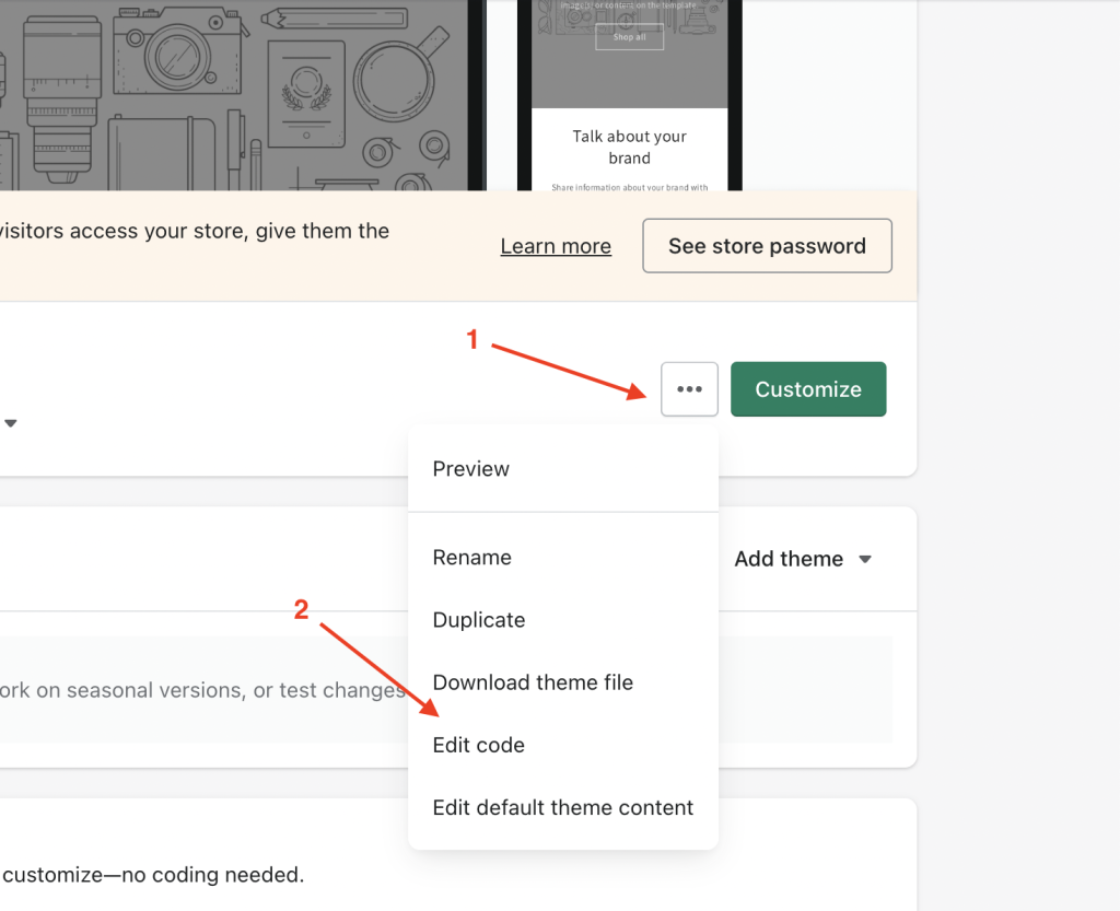
To get started, open your Impulse theme’s CSS file. This file is usually located within the “assets” directory of your theme files. Look for a file named “theme.css” and open it using your preferred code editor.
Step 2: Adding the CSS Code
Once you have the “theme.css” file open, scroll down to the end of the file. This is where you’ll add the custom CSS code that will adjust the font size of your mobile menu.
Copy and paste the following code snippet at the end of the “theme.css” file:
.mobile-nav__link--top-level { font-size: 26px; } .mobile-nav__child-item .mobile-nav__link, .mobile-nav__child-item a { font-size: 23px; }Step 3: Customizing Font Sizes
In the code snippet above, you’ll notice two separate CSS rules. The first rule, mobile-nav__link--top-level, controls the font size of the main links in your mobile menu. By default, it’s set to 26px. You can adjust this value to your preference. Increasing the value will make the font larger, while decreasing it will make the font smaller.
The second rule, mobile-nav__child-item .mobile-nav__link, targets the submenu items. Similarly, the font size is set to 23px by default. You can modify this value to change the font size of the submenu links. As with the main links, increasing the value makes the font larger, while decreasing it makes it smaller.
Step 4: Save and Preview
After you’ve made your desired font size adjustments, save the changes to the “theme.css” file. Now, it’s time to preview the changes on your website. Open your website on a mobile device or use your browser’s developer tools to simulate a mobile view. You should see the font size changes reflected in the mobile menu.
Conclusion
Customizing the font size of your mobile menu in the Impulse theme can significantly enhance the user experience on your website. By following these steps and adjusting the font sizes as needed, you’ll create a visually appealing and easy-to-navigate mobile menu that caters to your website visitors’ needs.
Remember that you can always fine-tune the font sizes based on your design preferences and user feedback. Experiment with different values until you find the perfect balance between readability and aesthetics for your mobile menu.